

Get your tickets to THE BIG THING 2026!

Project Quicksilver: A Real-Time Map of Global Temperature
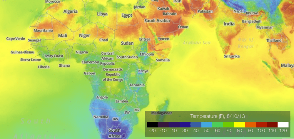
A Project Quicksilver temperature map displays a color-coded view of Africa, parts of Europe, and Asia in Fahrenheit on August 10, 2013. Northern Africa and the Middle East show the hottest areas in red and orange shades.

All of us at Expedition Portal are genuinely fond of maps of any kind. This is one of the most intriguing maps we’ve come across in a very long time. This color graded view of the world shows current temperature in real-time. At first blush that doesn’t seem like a big deal, but take some time to look it over and you’ll probably be surprised with what you see.

forecast.io/quicksilver/

Christophe Noel is a journalist from Prescott, Arizona. Born into a family of backcountry enthusiasts, Christophe grew up backpacking the mountains and deserts of the American West. An avid cyclist and bikepacker, he also has a passion for motorcycles, travel, food and overlanding.