

Are you an aspiring photographer dreaming of getting your imagery published, or an author suddenly tasked with shooting your own photos? From the guy who gets stuck fixing all your photos, here’s a list of the most common—and easily avoidable—photographic mistakes made by both novice and experienced author-photographers alike. We’ve all done some (ok all) of these at one time or another, often without even realizing it. Watch for these mistakes every time you shoot and the quality of your photos will improve dramatically.
Dust, Dirt, and Stains on Product
No one wants to buy a muddy tent, a hair-covered jacket, or dust-covered kitchenware. Contrary to how easy a good photo editor makes it look, sweeping up your dirty floor while keeping the scene realistic takes an incredible amount of time, concentration, and skill—it’s far easier to simply wipe it down before shooting. It’s a dusty planet, so get in the habit of checking before each press of the shutter. A mini-broom, soft cloth or feather duster works well for dust; a damp rag or small mop comes in handy for difficult spots. In a pinch, I’ve even used my Rocket.
Exception: deliberate filth to show how dirty something is, such as a blown shock leaking oil or a mud-covered trailer in a “torture-test” article.
Inappropriate Scenes or Backgrounds
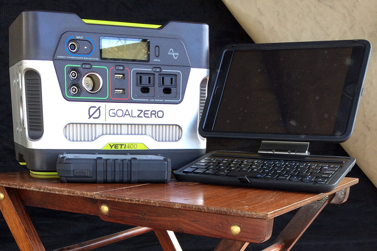
I was working on a camp oven review when, about five shots in, it dawned on me there was a fuzzy-but-unmistakable roll of toilet paper in the background (the perfect garnish for medium-rare filet mignon and garlic mashed potatoes). Likewise, if your subject is a camp chair review, your chairs should be in an environment that at least somewhat resembles a camp, not your downtown apartment balcony. You can’t rely on a shallow depth-of-field here either, make sure anything that detracts from the subject is completely out of the frame. Keeping the scene realistic and true-to-purpose helps legitimize a product review. Would you trust the “stability rating” of a camp chair when all of the photos show it placed on a solid, flat balcony?

A note on pets: we love animals, but it is best practice to keep the dogs and cats (and other pets) out of the background unless they are relevant to the story. Even then, do so sparingly—Fido should not be the subject of every single photo from your trek across South America.
Inappropriate or Incomplete Props
True story: during a table review for a certain premium publication, dried-up, shriveled produce somehow made it into the props, effectively ruining the beauty shots of a somewhat pricey table. Needless to say, photo edit on that article was a significant undertaking. When placing props, take the time to make sure they are of the same theme and quality as the rest of your composition.

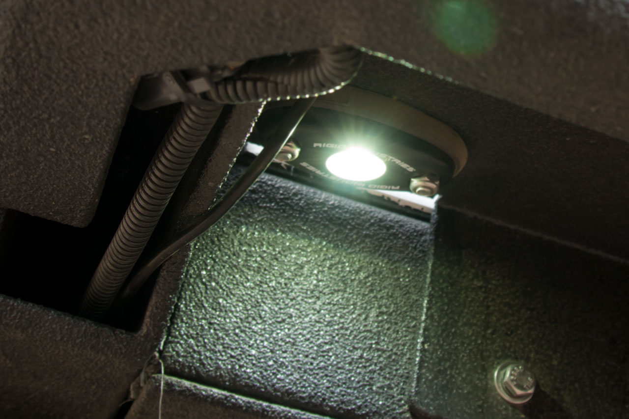
This also applies to the appearance of installed products, specifically that they look completely installed. For example, when shooting a shock or light on a truck, make sure all screws, bolts, and other hardware appear to be fully tightened down. Loose hardware looks unprofessional and can be a nightmare to “tighten” later in Photoshop.
Inappropriate (or non-existent) Focus
We often receive photos with completely irrelevant focus, or worse, no focus whatsoever. If you’re trying to show the inside of a cavernous tent, focusing in on the door’s zipper isn’t going to do the trick. Double-check your focus every time you shoot to make sure the subject is nice and crisp. If you’re unsure, capture more than once—you can always delete unwanted duplicates later. No, cranking the aperture all the way shut is not an acceptable substitute for properly focusing the camera.
While its easy to ensure proper focus on a product or vehicle shoot, this can be a real challenge in travel, people, or wildlife photos where the subject might move unexpectedly, and second chances may be impossible. Remember, photo editors have a variety of tricks up their sleeves. When in doubt, send in the photo—you’ll be surprised what we can salvage.
Inconsistent Color
Accurate color on-location or in a product’s natural environment can be difficult. Direct natural light can have a notably “yellow” hue, and indirect natural light is often very “blue”. Even in ideal conditions a camera’s auto white balance can be very easily confused. Try your best for accuracy, but remember consistency is more important. Fortunately, consistency is easy to accomplish across a series of photos: set your camera to manual white balance, adjust it to a setting that is as close to accurate as possible, then leave it there. If your photos are coming out a touch too blue that’s fine, as long as they are consistently a touch too blue it is easy to fix in post processing.

Many types of terrain tend to “bleed” into the product, and some terrains are almost unusable as backdrops (pink jurassic sandstone is one good example). Be aware of this when you start your shoot, and if its really bad, pick a different location. Also, be particularly careful in “controlled” environments such as garages. Your scene may have a comfortably consistent tint to it from artificial lighting, but an open door or window can easily disrupt that with a very difficult to correct blue gradient.
Inconsistent Orientation
As with color, its important to maintain a consistent orientation when shooting a series of products. If the first four products’ lead photos were landscape, don’t shoot the fifth one portrait—doing so causes chaos when a designer lays out an article. Even better, spend the extra few minutes to shoot both a portrait and a landscape version of each photo, the design team will love you.

Note: the same holds true for the orientation of the products themselves. If you shoot one knife with the blade pointing right, shoot the rest of the knives that way too.
Inconsistent Features
It’s best practice to keep consistency with the type of features you choose to capture when shooting a series of products. For example, say you’re doing a camp chair review. If you shoot the feet, legs, seat back, and cup holder on one chair, make sure you do the same for the rest of the chairs.
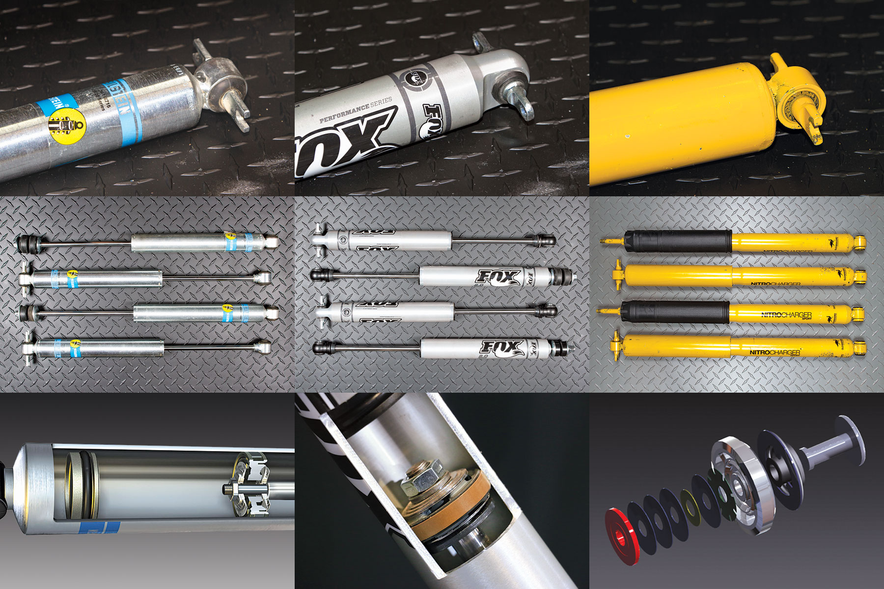
Exception: one product may have an exclusive feature absent from the others. Capture it, but make sure you still get the rest of the baseline features—we shouldn’t be missing a cup holder photo because one chair happens to have a bottle opener.
Reducing, Cropping and Sharpening
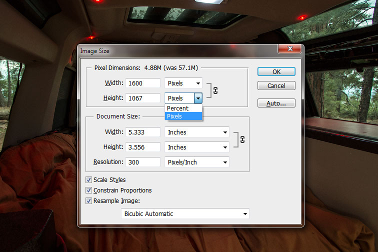
On reducing size—just don’t. Ever. While reducing the size of a photo may appear to “improve” the quality, what it’s really doing is destroying data which could have been used to correct problems in the photo so it can be used at a larger size. If the filesize is too big for email, use Google Drive or Dropbox and email the download link for the file.
It is bad form to assume you know exactly how a designer will place your photo—often times shots intended to showcase a specific feature wind up being used as a full page, full spread, or even the cover photo. Give the designer the option to place photos where they will have the biggest impact. If you have an idea, feel free to send in a suggested crop for your photos in addition to the uncropped originals.
Sharpening is also frequently abused. While it may look good on the screen, (over)sharpening can wreak havoc on the printing press—its best to leave your photos as-is. Even when you think the focus can be improved in post processing send in the original, there’s a good chance the photo editor knows a few tricks you don’t.
Oversaturation and Adobe Camera RAW
Photo editors work closely with designers and printers to make sure our equipment is perfectly calibrated to the press we’ll be printing on. In most cases, an author does not have that level of technical knowledge or calibration equipment. Doing too much tweaking to color and saturation typically only increases (often exponentially) the amount of work a photo editor must do to get a photo to print properly. Leave things like saturation and color balance to the photo editor.
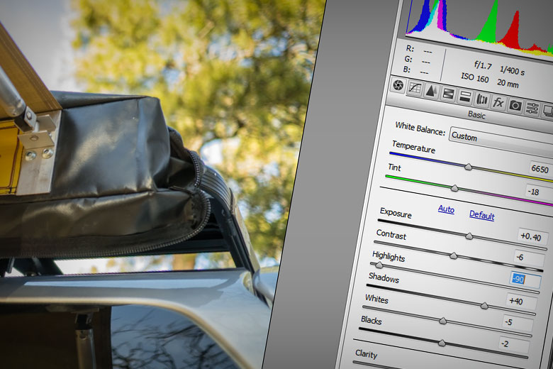
Keep adjustments in Adobe Camera RAW (ACR) to an absolute minimum. One of the more frustrating things that happens during photo edit is stumbling upon a series of photos carrying embedded ACR settings, with extreme deviations from the defaults. While this may initially look good, it creates a tremendous amount of extra work for designers and photo editors. With few exceptions, ACR data is only visible inside Photoshop and Lightroom, so the photos get selected and placed by the designer without the corrections you’ve made. Additionally, a photo editor is often forced to reset all of the ACR settings back to default before editing of the photos can begin, a time consuming process necessary to prevent grain and cross-photo color consistency from becoming absolute chaos.
Additional Reading
Most publications, print and digital, will have a set of guidelines on how to capture and process photography for submission to them as well as any special techniques they prefer. As with many things in life: when in doubt, ask.
Here’s a few invaluable resources and references which can aid you in your quest to become a better photographer:
- The Learn section of Photo.net is filled with useful tutorials, broken down by topic for easy reference, on everything from the digital darkroom to travel photography
- Karl Taylor and The Slanted Lens on YouTube both feature many free tutorials on concepts that apply in the field just as much as they do in studio
- And of course, there’s always the Photography and Videography Forum right here at Expedition Portal